Difference between revisions of "Graph"
Jump to navigation
Jump to search
Paul Chapman (talk | contribs) |
Paul Chapman (talk | contribs) |
||
| (11 intermediate revisions by the same user not shown) | |||
| Line 1: | Line 1: | ||
| + | ==Configuration== | ||
===Single Y-Axis Graphs=== | ===Single Y-Axis Graphs=== | ||
[[File:SingleY1.png|right|750px|Frame|Single Y-Axis Graph Configuration Panel]] | [[File:SingleY1.png|right|750px|Frame|Single Y-Axis Graph Configuration Panel]] | ||
| Line 157: | Line 158: | ||
<span style="color: red;"> | <span style="color: red;"> | ||
| − | '''Tip: If using a double Y-Axis graph to chart values of the same unit | + | '''Tip: If using a double Y-Axis graph to chart values of the same unit take care when comparing the two plots as they could have different scales depending on how each axis has been rendered.''' |
| − | take care when comparing the two plots as they could have different scales | ||
| − | depending on how each axis has been rendered.''' | ||
</Span> | </Span> | ||
| Line 245: | Line 244: | ||
|} | |} | ||
| − | + | <span style="color: red;"> | |
| − | + | '''Tip: When configuring a unit chart take care to choose values that make sense, for example accumulated unit cost has no meaning.''' | |
| + | </Span> | ||
[[Configuring Ellserve|Parent]] - [[Ellserve:Ellserve|Home]] | [[Configuring Ellserve|Parent]] - [[Ellserve:Ellserve|Home]] | ||
| Line 303: | Line 303: | ||
|- | |- | ||
| | | | ||
| − | :'''Category | + | :'''Category Type''' |
| | | | ||
:Determines the reporting category will be used to slice up the pie. | :Determines the reporting category will be used to slice up the pie. | ||
| Line 320: | Line 320: | ||
''Note: When filtering down to a small number of accounts the pie chart may contain only one slice. | ''Note: When filtering down to a small number of accounts the pie chart may contain only one slice. | ||
| + | |||
| + | [[Configuring Ellserve|Parent]] - [[Ellserve:Ellserve|Home]] | ||
| + | |||
| + | |||
| + | ==Usage== | ||
| + | Graphs have no interactive usage features. | ||
[[Configuring Ellserve|Parent]] - [[Ellserve:Ellserve|Home]] | [[Configuring Ellserve|Parent]] - [[Ellserve:Ellserve|Home]] | ||
Latest revision as of 12:39, 3 October 2013
Configuration
Single Y-Axis Graphs
| Purpose |
|
|---|---|
| Example |
|
| Settings | Description | Values |
|---|---|---|
|
| |
|
|
|
|
|
|
|
|
|
|
|
|
|
||
|
|
|
|
|
Note: To make a parameter available for in-session setting, check the box to the left of the setting parameter.
Double Y-Axis Graphs
| Purpose |
|
|---|---|
| Example |
|
| Settings | Description | Values |
|---|---|---|
|
| |
|
|
|
|
|
|
|
|
|
|
|
|
|
|
|
|
|
|
|
|
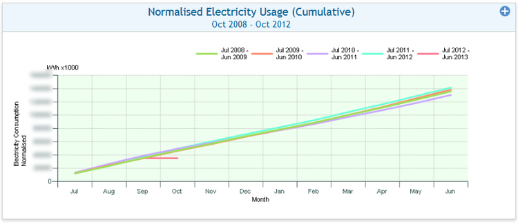
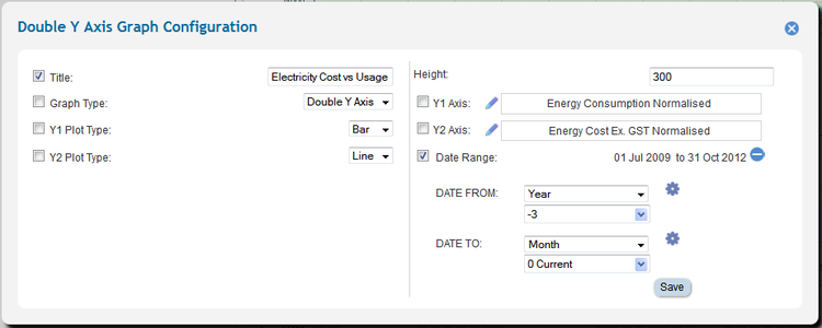
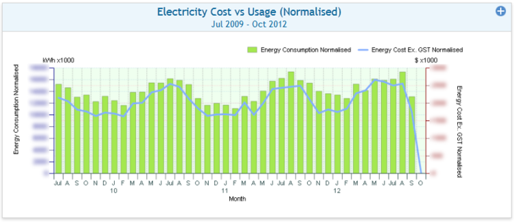
Tip: If using a double Y-Axis graph to chart values of the same unit take care when comparing the two plots as they could have different scales depending on how each axis has been rendered.
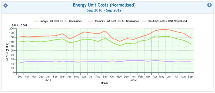
Unit Graphs
| Purpose |
|
|---|---|
| Example |
|
| Settings | Description | Values |
|---|---|---|
|
| |
|
|
|
|
|
|
|
| |
|
|
|
|
|
|
|
|
|
|
|
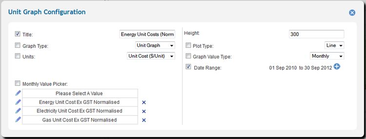
Tip: When configuring a unit chart take care to choose values that make sense, for example accumulated unit cost has no meaning.
Pie Graphs
| Purpose |
|
|---|---|
| Example |
|
| Settings | Description | Values |
|---|---|---|
|
| |
|
|
|
|
|
|
|
| |
|
|
|
|
|
|
|
|
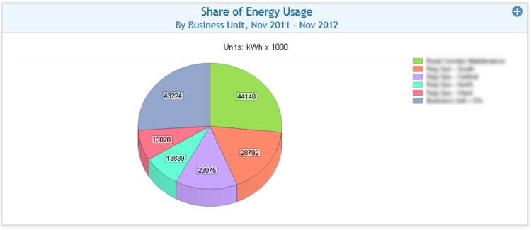
Note: When filtering down to a small number of accounts the pie chart may contain only one slice.
Usage
Graphs have no interactive usage features.

