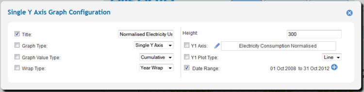
Configuration
Single Y-Axis Graphs
| Purpose
|
- To chart a single time series data value.
|
| Example
|
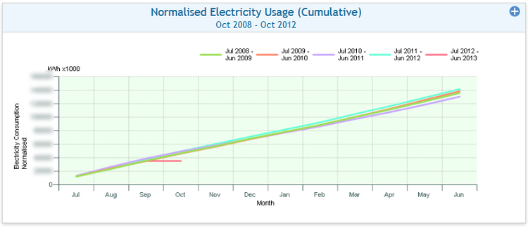
- To chart normalised energy consumption for a group of accounts cumulatively, by year for the last four years.
|
| Settings
|
Description
|
Values
|
- Title
|
- Graph display title
|
- Custom
|
- Graph type
|
- Determines the type of chart displayed
|
- Single Y-Axis
|
- Graph value type
|
- Determines if point values are charted singly or cumulatively
|
|
- Wrap type
|
- Determines if values are charted continuously or wrapped buy financial year
|
|
- Height
|
- Determines the vertical height (in pixels) of the chart on the rendered web page
|
- Custom
|
- Y-Axis value type
|
- Value to be charted
|
- All time series data values
|
- Y-Axis plot type
|
- Determines the on-screen appearance of the data plot
|
|
- Date range
|
- Reporting time period
|
- Date range from date picker
|
Note: To make a parameter available for in-session setting, check the box to the left of the setting parameter.
Parent - Home
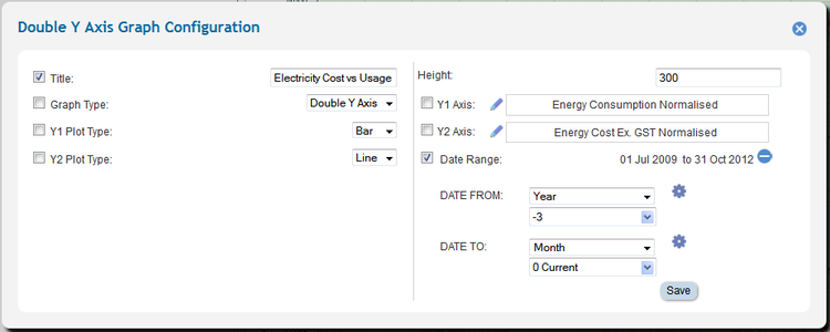
Double Y-Axis Graphs
| Purpose
|
- To chart two time series data values of the same or different units against each other.
|
| Example
|
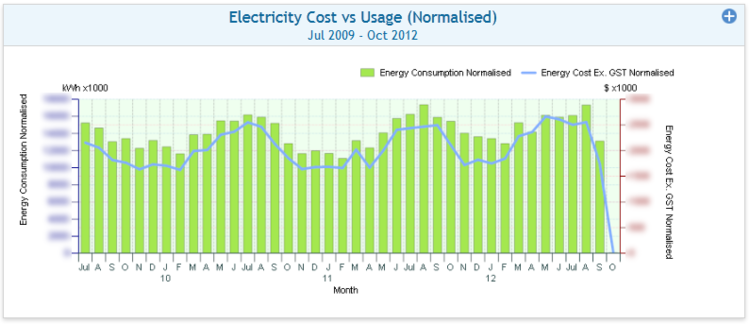
- To chart normalised energy consumption for a single account cumulatively against cost for the last three financial years.
|
Tip: If using a double Y-Axis graph to chart values of the same unit take care when comparing the two plots as they could have different scales depending on how each axis has been rendered.
Parent - Home
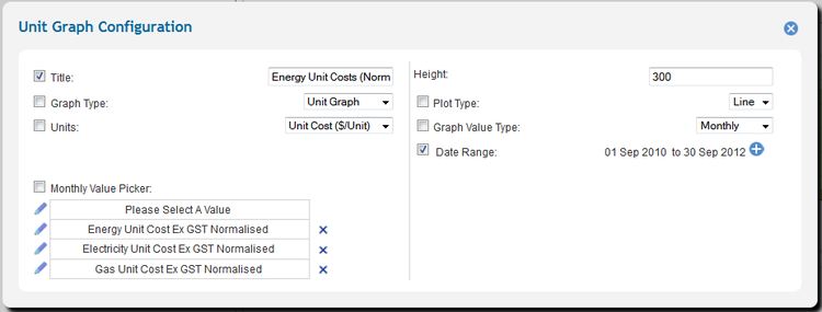
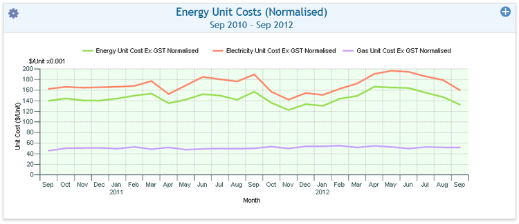
Unit Graphs
| Purpose
|
- To chart mutiple time series data values of the same units against each other.
|
| Example
|
- To chart the unit cost of all energy, electricity and gas for the last two calendar years.
|
| Settings
|
Description
|
Values
|
- Title
|
- Graph display title
|
- Custom
|
- Graph type
|
- Determines the type of chart displayed
|
- Unit
|
- Units
|
- Determines the unit type that can be displayed on the graph.
|
- Cost ($)
- Commodity Group Usage
- Emissions tCO2</Sub}e
- unit Cost ($/Unit)
|
- Monthly values
|
- Values to be charted
|
- All time series data values sharing the selected graphing unit
|
- Height
|
- Determines the vertical height (in pixels) of the chart on the rendered web page
|
- Custom
|
- Plot type
|
- Determines the on-screen appearance of the charted values.
|
|
- Graph value type
|
- Determines if point values are charted singly or cumulatively
|
|
- Date range
|
- Reporting time period
|
- Date range from date picker
|
Tip: When configuring a unit chart take care to choose values that make sense, for example accumulated unit cost has no meaning.
Parent - Home
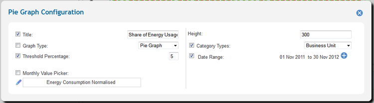
Pie Graphs
| Purpose
|
- To chart accumulated time series data values for a single data item by a reporting category.
|
| Example
|
- To chart the contribution of each business unit to total energy consumption for the last 12 months.
|
| Settings
|
Description
|
Values
|
- Title
|
- Graph display title
|
- Custom
|
- Graph type
|
- Determines the type of chart displayed
|
- Pie
|
- Threshold Percentage
|
- Determines the threshold over which and single contributing group receives a dedicated slice.
|
- Custom
|
- Monthly values
|
- Values to be charted
|
- All time series data values sharing the selected graphing unit
|
- Height
|
- Determines the vertical height (in pixels) of the chart on the rendered web page
|
- Custom
|
- Category Type
|
- Determines the reporting category will be used to slice up the pie.
|
- Custom
|
- Date range
|
- Reporting time period
|
- Date range from date picker
|
Note: When filtering down to a small number of accounts the pie chart may contain only one slice.
Parent - Home
Usage
Graphs have no interactive usage features.
Parent - Home