EMK:Results
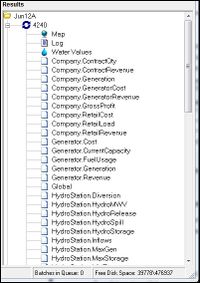
The Result Set produced by a Run appears in the Results Panel on the right of the Main Window.
The Result Set may contain the following components:
- The Map: allows Results to be viewed geographically on a map.
- The Log: contains Run event information (e.g. Run start and end times and error messages).
- Result Charts: Charts displaying selected Run Results by Entity.Trait type (charting is also available for any Global Traits produced during the Run).
- Reports: Excel-compatible csv files, either:
- Raw Data Reports - Entity.Trait and Global Traits outputs in CSV form; or
- Output Specification Reports as defined in the associated OS Resource.
To display an Output or Report either double click on it or right click on it and select view from the popup menu. The Output or report will then open as a Results Chart or in Excel (or whatever application you have selected as the default program for CSV format files).
Reports can also be viewed directly in Excel by opening them from the results\<RunID>\<Resource Version> directory in the relevant Working Directory. For more on Reports see Reports.
To Delete an entire Results Set for a Run or group of Runs highlight the Run's Batch number or Run name respectively, then right click and select delete from the popup menu, alternatively after highlighting, delete can be selected from the Results menu. Reports can be deleted in the same fashion.
Warning: All Reports associated with a Run are deleted with the Run.
Archiving Results
This function copies the current contents of the Results Directory to a user-defined directory and refreshes the current Results directory. Reports or Results can be archived from the Archive Results item in the Results menu. A dialogue box will then appear asking you to confirm or cancel the archiving. Archived results directories can be accessed from Windows Explorer by opening the Working Directory. Once archived, they no longer appear in the Results Panel.
Results Charts
All EMarket Result charts use a standard chart viewer.
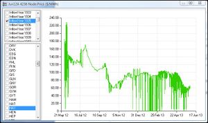
The Chart Viewer has three components:
- Title Bar: contains information about the result being charted
- Series Selector: (top left) which allows selection of individual time series created for a Run through the Volatility Matrix feature
- Item Selector: (bottom left) allows selection of individual items which share the same Enitity.Trait (e.g in the Chart for the Node.Price Enitity.Trait the Price trace can be charted for each Node item independently.
- Chart: contains a graph containing one line for every combination of the selected Series and Element
The Title Bar
The Title bar contains the following information:
- The name of the Run resource Instance used to create the data
- The Run Id (Batch Number)
- The Entity.Trait being charted
- the units of measurement for the Entity.Trait
The Series Selector
The Series Selector is used to select individual time series in the Run Results (the number of time series contained in the Results of a Run is controlled by the Volatility Matrix). The check boxes allow you to select which time series will appear in the Chart. More than one series can be selected at any time. If no series are selected no data will be displayed in the main chart area. For example if the Run produced a time series for each of inflow years: 2001, 2002, 2003 and 2004 you can chart a data item for all or any combination of these years.
The Item Selector
Check one or more of the boxes to the left of the list items (Instances) to display data for those list items.
The above figure illustrates a case where the Node.Price Entity.Trait has been selected for charting. The time series is selected as InflowYear:1935, and the Item Selector has been used to select the BEN Node instances for charting Nodal Price.
The Chart
The Chart displays a line for each selected Series/Element combination, with Entity.Trait quantity on the Y-Axis and time (taken from the length of the Run) on the X-Axis.
To move around the chart area hold down the right mouse button and drag the chart around.
To zoom in on an area move the cursor to the upper left hand corner of the area you want zoomed in on then hold down the left mouse button and drag the mouse to describe a rectangular area. Let go of the mouse button and the chart will resize to magnify the rectangular area.
'To zoom X or Y axis alone hold down <ctrl> while making mouse movements to adjust the horizontal and vertical zooms.
Press <home> to return the chart to it's original size.
Results Map
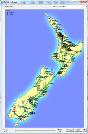
The Results Map allows the Demand, injection, power flow and subsequent pricing effects across the country to be viewed for a Run. To access the Map, double-click on the Map label for a run in the Results Panel.
The Results Map components are:
- Tick Indicator
- Series Selector
- Tick Selector
- Map Display
Tick Indicator
The Tick Indicator, located in the upper left corner of the Map Window, is a non-editable field indicating the Tick in the Run for which data is being displayed by the Map. The Period type is also displayed here (e.g. Day or Night).
Series Selector
The Series Selector provides a drop down selection list for all time series produced for the Run (only one time series can be viewed on the Map at a time.) A Run may contain several time series, e.g. one for each Inflow year in the Run. Specifying time series output for Run is carried out using the Volatility Matrix in the Run Window.
Tick Selector
The Tick Selector consists of:
- Date Slider: left click and drag this control to change the Tick for the Map between the Run start and end dates (indicated on the left and right of the slider). Releasing the mouse selects a new Tick number and causes the display to change accordingly. A small box appears above the slider while it is being held by the mouse - this number indicates the number of the Tick that would be selected if the mouse button were released at that point.
- Previous & Next buttons: are used to set the new Tick number to one less or one more than current Tick number, useful when examining Ticks closely related in time. The <alt> <n> or <alt> <p> keys can be used instead of the buttons.
- Animate Results Button: Opens the Animate Results Window which is used to set parameters controlling the Tick-by-Tick animation of Map and Chart displays. The Animate Results Window has the following components:
- Start/Stop button: This button is used to start and stop the animation on the map and associated charts.
- Speed Slider: This control is used to set the speed at which the animation changes from one Tick to the next.
- Show Cursor on Graphs Check Box: When checked this control causes a vertical cursor line to appear on any currently open Chart Windows. The line will intersect the X-axis of the Chart at the point in time (Tick) currently being displayed on the Map (the cursor is only visible when the Map is in 'Animate Results' Mode.
Note: Closing the Animate Results Window will not cause the Map to fall out of animation mode. To stop animation it is necessary to re-open the Animation Results Window and click the Start/Stop button (which will be displaying the text: "Stop").
The Map Display
The Map displays the Static Lines, Nodes and Generators allocated to the Run in the Connections Window (if included in the Binary Outputs for the Run) and the dynamic Generation, Demand, Line Flow and Nodal Price information.
On initial opening the Map displays the whole country in overview. At this level only the major Nodes, Lines and Generators are discernible. Zooming in brings greater levels of detail to the display, in which minor Nodes and Lines included in the Grid become visible.
To zoom the Map place the mouse cursor in an appropriate position for a drag operation then click and drag the mouse down and to the left to create a zoom rectangle. Release the mouse to magnify the area within the rectangle to fill the display area. Alternatively hold <Ctrl> while pressing the up/down arrow key to zoom in/out. To navigate the zoomed map simply use the arrow keys to move around.
Generation and Demand
Generation is displayed on the map by a red Generation bar adjacent to injection Nodes. Demand is displayed in much the same way as Generation, but with a white Demand bar at Nodes with Demand
Line Flow
Lines connecting Nodes are represented on the Map by coloured lines. The loading capacity of the Lines connecting the Grid is represented by the thickness of the line displayed. The thicker the line, the higher the flow relative to the line's capacity. Line Flow direction is indicated by the movement of the "electrons" on the Line.
If a Line reaches its load limit and constrains, then the line is displayed in red. The higher the probability of a line constraining, the closer the colour will approach red.
Lines having an outage (capacity set to zero) appear as dashed on the map, while Lines with a rating change applying during the period are faded towards white according to how much capacity has been removed. These features make it easier to visualise the Grid and work out what is happening in any particular period.
Note: Constrained lines will not glow red if there is no Lagrange multiplier data.
Nodal Prices
The range of Nodal Prices is indicated by the Nodal Price range to the top left of the Map. The top-most figure indicates the highest Nodal Price present for the Tick, and the figure beneath it is the lowest Nodal Price for the Tick. The small coloured square to left of the price indicates the colour that Nodes with this price will appear on the map. Nodes with Prices intermediate between the highest and lowest Nodal Price figures will appear on the map with a colour between the two.
Viewing Data for Nodes and Lines
You can view data for individual Nodes or Lines by maneuvering the mouse cursor cross hairs over the top of a Node or a Line. A temporary box will appear containing data about that Node or Line. Information that appears in this box is not fixed. For example, if a Line is not constrained then its "Constrained" value will not appear in the Line data box. If a Node has no Demand then Demand data will not appear in the Node data box.
To locate an object on the map double click on the map display area, type <f>, enter the name of the object to be found and then click on the OK button. A flashing pink circle on the map identifies the location of the Node if found.
The Run Log
The Run Log contains information concerning the progress of execution of a Run event (e.g. Start Time and End Times).
The name and ID of the Run, and the Version number of the EMarket program appear on the first line of log.
Note that the Log contains all error messages generated during the Run and should be consulted as matter of course to ensure your Run has executed cleanly.


